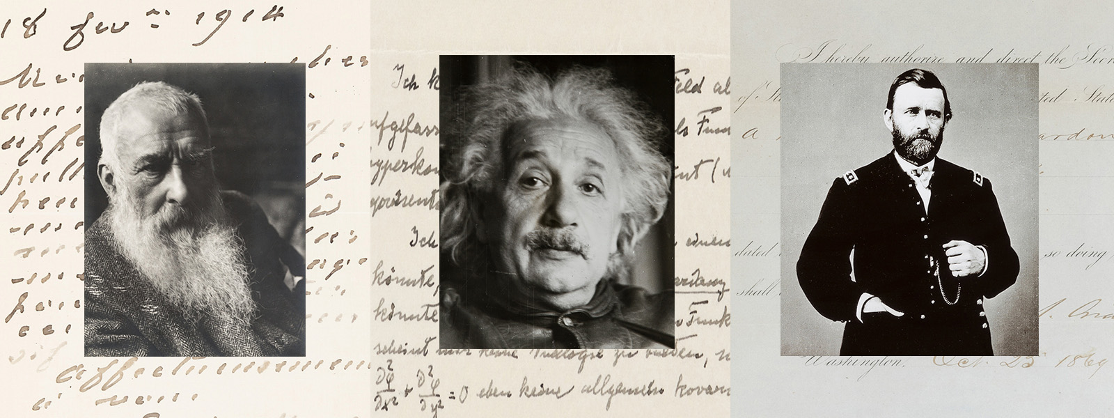
WHAT DOES THE PENMANSHIP OF ALBERT EINSTEIN, CLAUDE MONET, ULYSSES S. GRANT AND OTHER FAMOUS FIGURES SAY ABOUT THEM? TWO HANDWRITING EXPERTS WEIGH IN.
By Andrew Nodell
Historical manuscripts and letters provide us with a tangible link to the past. In more modern instances we can garner a glimpse into the personality of historic figures through photographs, recorded interviews and their own written text, but an analysis of handwriting can be even more intimate and unfiltered. Heritage’s April 5 Historical Manuscripts Signature® Auction, which opens for bidding this month, offers the opportunity to hold history in your hand with documents from Louis XIV, Napoleon Bonaparte, Theodore Roosevelt, Henri Matisse and many others. Here we’ve enlisted the help of noted handwriting experts Kathi McKnight and Sheila Lowe to analyze the personalities of five notable names represented in the auction through their signatures and handwriting.
Enlarge
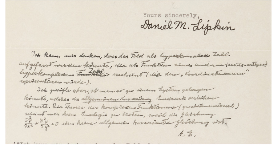
Albert Einstein (1879-1955)
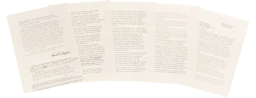
The name Einstein has become synonymous with genius. But what does the Nobel Prize-winning physicist’s handwriting reveal? Noting his “compact, simplified, yet highly connected handwriting,” forensic document examiner and author Sheila Lowe says this indicates the “ability to think quickly and make great leaps of logic, reaching a common-sense conclusion,” while his speed of writing indicates enthusiasm. Lowe – who uses the gestalt method of analysis, which considers handwriting as a whole, made up of arrangement on the page, letter designs and writing rhythm – says the many angles in this writing are the sign of an analytical mind and that “the movement suggests impatience in one who would not suffer fools gladly.”
Certified graphologist and author Kathi McKnight – who uses a method of analysis called trait-stroke, which analyzes each piece and builds them up into a picture – also notes the “tiny size” of Einstein’s handwriting, which is even smaller than the typed font. “The smaller the handwriting, the greater one’s ability to focus, concentrate and condense massive amounts of information into microscopic form.”
Robert E. Lee (1807-1870)
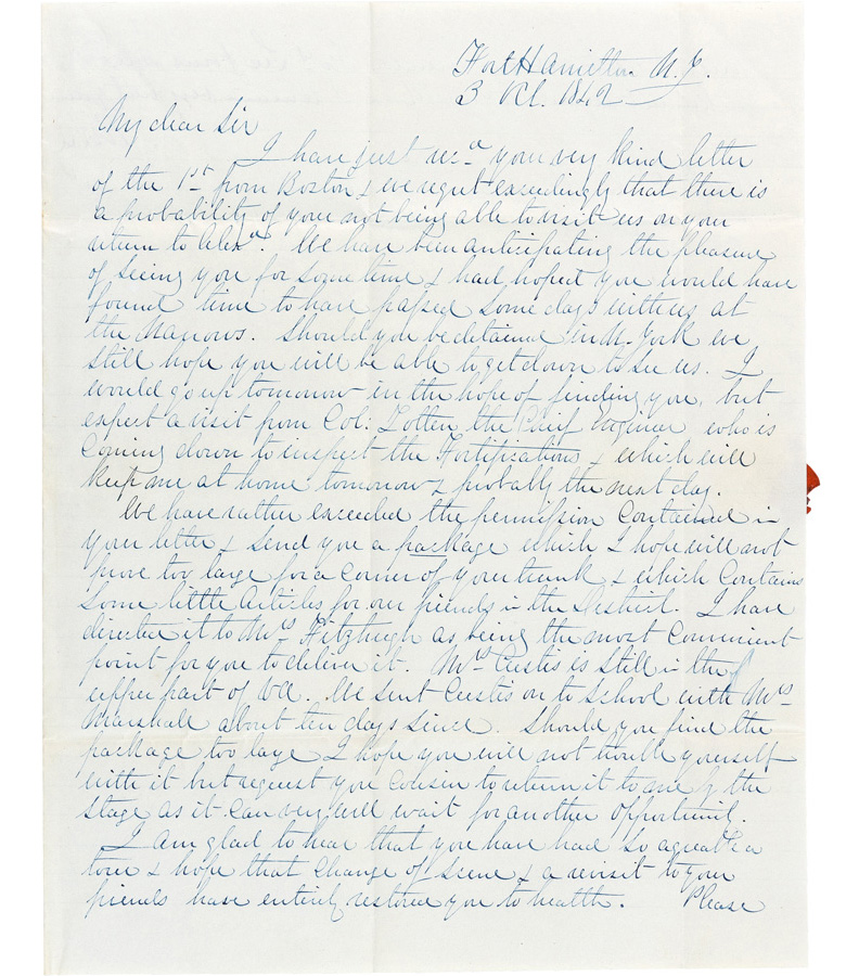
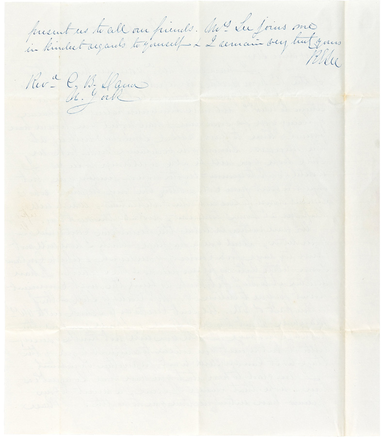
As general in chief of the Confederacy during the American Civil War, Robert E. Lee earned a reputation for his skillful military maneuvers. “Firm determination is the hallmark of this handwriting, which is like a tank in its inexorable movement forward,” Lowe explains. Describing the downstrokes of many letters as “extra-firm,” she says this “speaks to how difficult it was for him to ever give up, regardless of what he was doing.”
McKnight goes on to describe Lee’s handwriting as “exquisite, but much lies between the lines.” Although this letter was written on unlined paper, the Virginia-born general’s text is strikingly well spaced. “This reveals a perfectionist,” she says. In the example, Lee sharply crossed his lowercase T’s, which McKnight explains “reveals anger and irritation, particularly when they are written that way the majority of the time.” Coupled with the “steamroller stroke” – where the lower loop of the Y resembles a V, signifying “an individual who charges ahead relentlessly, undeterred” – Lee appears “poised for battle regardless of when this was written.” Through his M’s and N’s, McKnight sees “Lee’s superior intelligence, sharp analytical skills and profound depth of thought toward the subject at hand.”
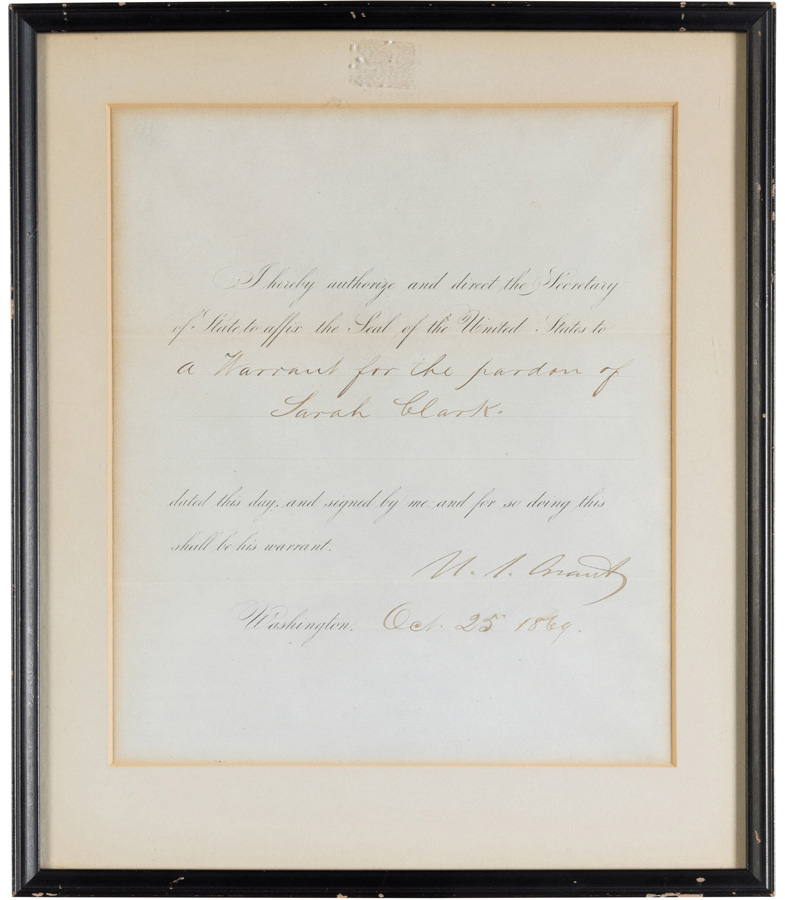
Ulysses S. Grant (1822-1885)
On the opposite side of the American Civil War, General Ulysses S. Grant led the Union Army to victory. While General Lee’s handwriting shows firm downstrokes, McKnight was struck by the unexpectedly light pressure General Grant applied to his handwriting. “Light pressure reveals someone who can let go of grudges and resentments easier than most,” she says. “They can also move from place to place and job to job easier than most.” She was also surprised by the ample spacing within the words of Grant’s document. “The generous spacing within his words reveals a genuine generosity of spirit as a man.”
Lowe notes that the spacing in Grant’s handwriting reveals another aspect of the military leader and U.S. president’s personality. “He gave others their space and, in fact, needed a great deal of elbow room himself,” she explains. “He left room for his intuition to supply information and, with a tendency to rush things, trusted his gut reactions – perhaps sometimes to his regret. He was a strongly emotional man but had enough self-control to wait to act when the time was right.”
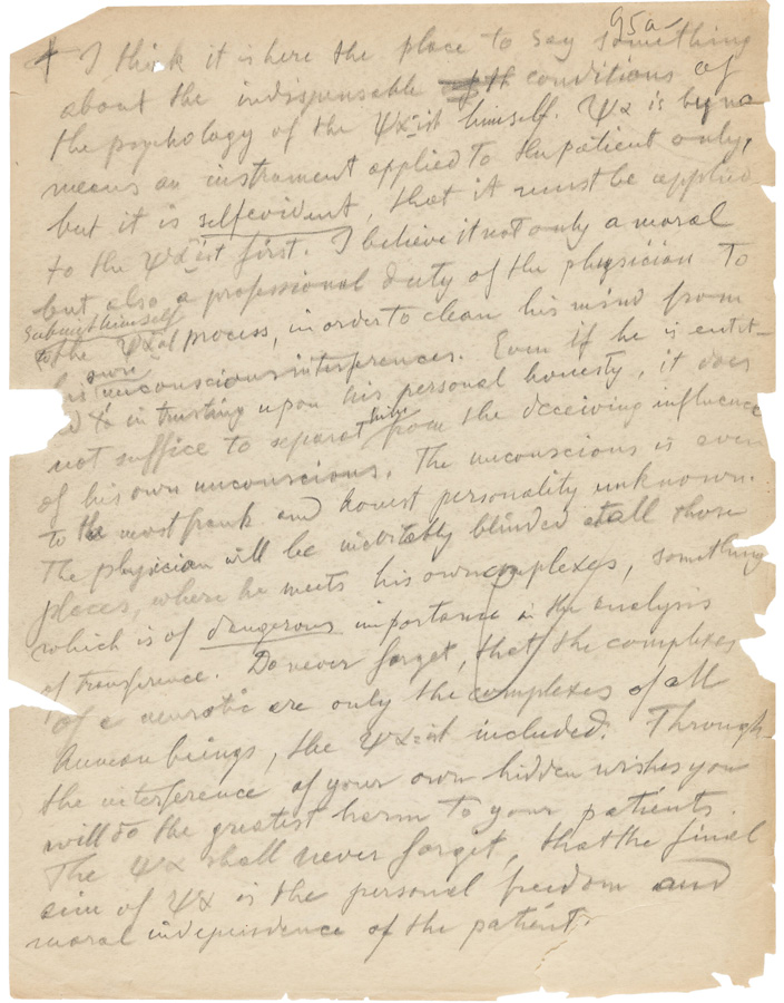
Carl Jung (1875-1961)
Swiss psychiatrist and psychoanalyst Carl Jung continues to be regarded as one of the most influential minds in the field of psychology. As McKnight points out, “many of the best psychologists are the ones who have faced their own challenges or demons to sort through.” She adds, “He writes with great speed, showing he thinks fast yet he does not sacrifice form – the writing is legible despite the speed. He doesn’t stop to worry about whether his writing is perfect.” This, she says, indicates his “very human, vulnerable flaws.” A specific example of this is seen in one of his ending strokes in the word “am,” which reveals weariness for caring for others and a desire to be on the receiving end of care and concern.
Lowe notes a “remarkably normal pressure pattern of light and dark strokes” in this manuscript, despite being written in pencil. She also observes Jung’s “lyrical movement underlying the writing and its fast, simplified movement with appropriate breaks between letters,” which indicates a quick, intuitive thinker. “His mind was moving so rapidly he could hardly get his thoughts down on paper.”
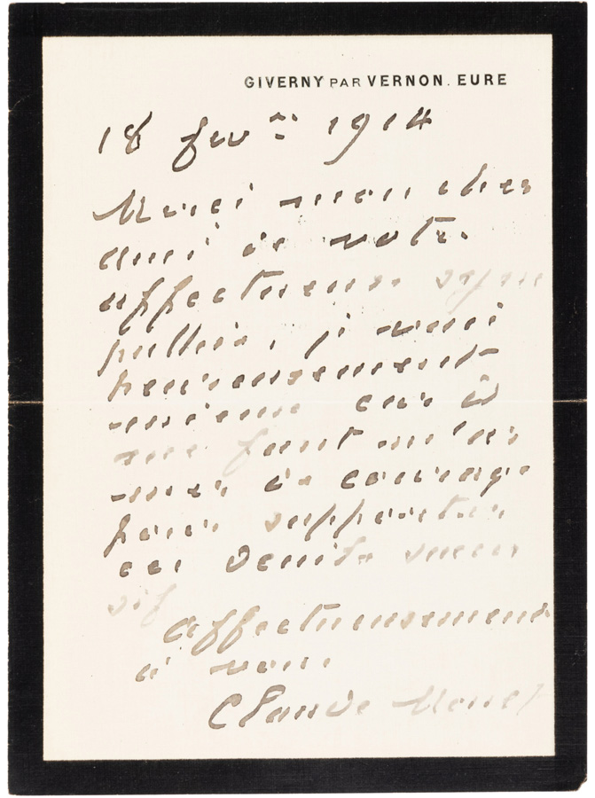
Claude Monet (1840-1926)
Impressionist painter Claude Monet’s signature is recognizable by art lovers throughout the world from his celebrated canvases, but rarely are we offered a more comprehensive view of the artist’s handwriting. McKnight points out that Monet chose here to print rather than write in cursive. “The right slant in his printscript gives way to slight complexity and duality,” she says. “There are no flourishing loops often found in cursive. This sample is almost skeletal-like in its form.” While this would typically indicate an emotional detachment devoid of intimacy, we know this is not an accurate analysis of Monet based on his impassioned canvases, as well as his handwriting. “The slant of both his handwriting and signature reveals a truth not to be denied: He is sentimental and is moved by what speaks to his heart.”
The thick, daubed-on strokes of Monet’s handwriting are common in artists, Lowe explains. In handwriting analysis, this is called “pastosity,” or the extra flow of ink applied to the page. “This type of stroke is produced by holding the pen farther back on the barrel, away from the nib,” she says. “It suggests sensuality, warmth and enjoyment of life.” Penned in 1914, Monet’s writing in this example was likely affected by his eyesight, which began to decline in the decade before this letter due to cataracts. Despite this, Lowe observes, “he maintained a positive mental outlook and kept pushing himself to greater heights.”
Go here for the full list of lots in Heritage’s April 5 Historical Manuscripts Signature® Auction.
 ANDREW NODELL is a contributor to Intelligent Collector.

